


If you have ever shopped for paint, you know there are hundreds of different shades and options for every color. If you want white walls, for example, you can choose from White Cloud, White Dove, Dove Wing, Timid White, Crisp Linen, Bavarian Cream, and Crème Fraiche — and those are just options from Benjamin Moore & Co. When the possibilities include the entire palette of colors and other brands of paint, the choices become nearly overwhelming.
If you want an easy solution, you can follow the example set by the owners of this house and choose EVERY color. But, unless you run a daycare or really don’t care, that’s probably not the best idea.
Instead, use the tips below to choose the right paint color for your room.
Choosing a Mood
As you consider your options, the first question you should ask yourself is this: What mood do I want to evoke in this room?
Do you want a space that encourages relaxation or one that creates a burst of energy when you walk into the room?
To find the right paint colors to match the desired mood, use our cheat sheet below. This photo shows one of our client’s rooms, which we edited to show the different moods color can evoke. Take a look at each photo and compare what you feel from each room. Which color scheme and mood do you prefer?
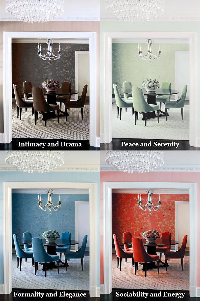
Formality and Elegance: Deep blue-green colors and light, neutral colors
Intimacy and Drama: Dark, strong colors (deep reds & deep purples)
Peace and Serenity: Neutral colors and soft, cool colors; pastels (light blue, light green, white)
Sociability and Energy: Contrasting, warm, and bright colors (red, orange, yellow)
It’s not a perfect science, but some psychological studies have shown colors incite the following feelings and physiological responses:
Red: Energy and excitement. Very strong physical color that can raise your heart rate.
Orange: Warmth and passion. Focuses mind on comfort and security, also adds energy.
Yellow: Optimism and friendliness. Very strong emotional color that can lift confidence and mood.
Green: Harmony and peace. A reassuring color that promotes balance. Deep darker greens will help you feel more grounded, while lighter, pastel-colored greens can feel revitalizing.
Blue: Calm and soothing. Affects the mind unlike the physical reaction to red; relaxes the mind and aids in concentration.
Violet: Spirituality and luxury. A color that can bring about introspection, often communicates a strong quality of life and abundance.
Black: Sophistication and heaviness. A very serious color that can bring feelings of security, black conveys power as well; it is best used as an accent color in an office or workplace.
White: Purity and simplicity. A very clean color that can improve your perception of the room.
Brown: Reliability and support. Mostly has elements of red, yellow, and black, but encourages a feeling of support, as brown is an earth tone and can promote feeling grounded.

Finding the Right Color Combination
Before choosing any specific color, make sure you know what furniture or fabric you are going to use for that room. There’s nothing worse than finding that “Spring Meadow Green” is the perfect color for the living room you are remodeling, just to discover that you can’t find any furniture or fixings to match it.
When you select color combinations for your rooms, a color wheel like this one may help. Colors on the opposite ends of the wheel are complementary colors, which produce the most intense, contrasting result.
As you consider your options, test color combinations that you might not usually choose. You never know what will work until you try.